Statistics
| © 2004 Rasmus ehf |
Statistics |
Lesson 5.
Pie graphs and misleading graphs
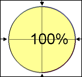
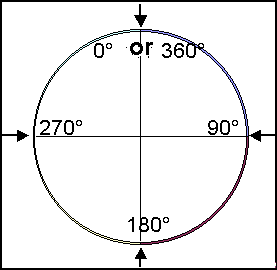
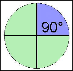
Circles can be measured in percentage and degrees.
|
A full circle is 100% |
The circumference is 360 degrees |
|
|
 |
|
|
1% of a circle is |
|
1% = 3.6° |
 |
 |
|
Pie graph
Draw a circle which is 35% red, 45% green and 20% blue.
Remember that 1% = 3.6°
| Colors | Calculate the degrees | 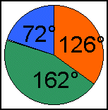 |
| red | 35%×3.6°=126° | |
| green | 45%×3.6°=162° | |
| blue | 20%×3.6°=72° |
This needs practice. You will need a compass and a protractor. Begin by marking the center with a + and placing the point of the compass on the +.
Next draw the circle with the compass. Now draw the radius by joining the center of the circle to the circumference. Now use the protractor to measure the number of degrees for each section. Color the sections with the correct colour as shown above.
You can also make pie graphs by using the computer program Excel. You enter the numbers and the program will calculate and draw the circle and the sections. It is good to know how to use both methods
Another way of calculating the sections is by thinking of the percentages as decimal numbers.
| Colors | Calculate the degrees | |
| red | 0.35×360°=126° | |
| green | 0.45×360°=162° | |
| blue | 0.20×360°=72° |
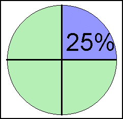
This is how you change degrees into percentages, for example 72 degrees
![]()
Misleading graphs
Graphs can often be misleading.
|
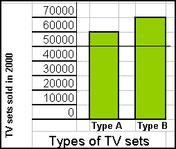
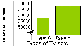
Example 1 Sales of television sets
|
|
|
|
| Let's say that the
salesperson for Type B would like to emphasize the superiority of his
product. He takes the upper part of the graph and enlarges it. Now, at a
glance, it looks as if the sales for Type B are twice as many as for Type
A. |
 |
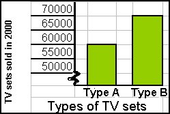
| If the scale on the
axis does not begin at 0, the axis must be shown with a broken line to
indicate that the graph is not an accurate representation.
Here the vertical axis is drawn with a broken line to show that the scale does not begin with 0. |
 |
Other tactics are used in advertising to influence people's beliefs.
Incorrect information used in graphs.
Inaccurate ratios shown in graphs.
Example 2 Sales of television sets
The salesperson for Type B was reprimanded for not using a broken line to show that the scale was not complete.
|
He made a new graph and this time used a broken line for the vertical axis. |
But the ratios in the graph are still misleading! |
|
Now it looks as if sales for Type B are almost four times more than those for Type A if you look at the area covered by the bars. What is wrong with this graph? Answer: The width of the bar for Type B is twice as wide as the one for Type A. |
|
In statistics, the ratios shown in drawings must always be accurate.
If not, the information is misleading.
It is important to be able to read the correct facts from graphs in order to interpret them accurately.
Practice these methods and then try Quiz 5 on
Statistics.
P.S. Remember to fill in your Check list as you go
through the exercises and quizzes.